For as long as my family has owned our 1998 Honda Accord my dad has been recording the fuel use and mileage at every fill-up. Since buying the car in 2000 we have amassed a huge collection of driving data that for the most past has not been put to use.
This data is actually extremely useful when looking at the overall cost of the car, how well it is faring, and whether it is in need of a replacement.
In the book that we recorded the data in we tracked the odometer reading, the trip distance between fill-ups, the cost of the fill-up, the number of litres we put in, and the cost/l of the gas we put in (all regular grade gas).
The Results
After sorting though the data I have come up with a series of graphs and statistics showing what I consider to be the most meaningful results.
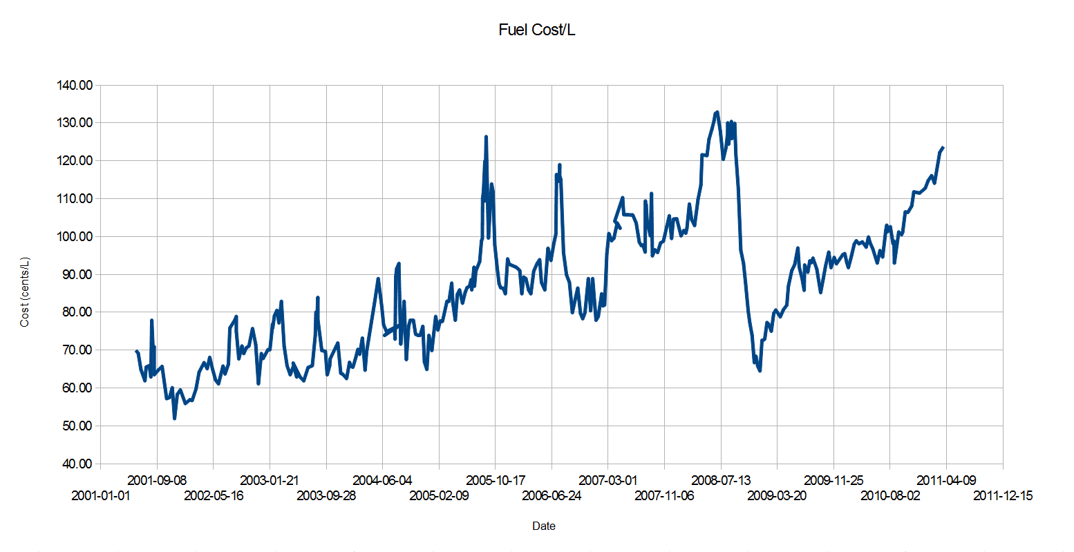
This first graph shows the cost of fuel, in cents/L, at each fill-up. While it is possible to look up the cost of fuel online over this same time period it is nice to see our collected data follows what the market price was quite closely. With the number of data points available it is great to see the detail in the fluctuations in price. At some point I plan on making a version of this graph that includes the prices adjusted for inflation. It would also be nice to plot this price data along with the geographical data from when it was bought, while while available in my dads records, would be completely impractical to do.
With the amount of data in this graph it is amazing to be able to see the huge rise in gas prices just in the past 10 years where the lowest price on record is close to 51 cents/L all the way to prices over 130 cents/L. Though this graph does not yet extend all the way to 2013 yet, it does show that the gas prices we are paying now are still around the levels seen during the massive price spike in 2008, followed by the crash in fuel prices and the beginning of the economic recession.
This graph outlines the Fuel Cost Per Litre adjusted for inflation in 2013 dollars and, while looking similar to the graph above, does have some info of its own to offer. As this graph is showing the fuel costs adjusted for inflation the further from 2013 the greater the disparity compared to the unadjusted values. The first thing to note is that the cost of fuel has still be increasing even when inflation is taken into account with the price from 2001 till 2011 nearly doubling from 60 to 120 cents/L. While the first graph shows some amazingly low fuel prices (as low as 51 cents/L), those work out to nearly 65 cents/L when adjusted for inflation. When looking at the fuel price crash in 2008 you can see that at its highest (as well as a similar spike in 2005) the fuel price was over 140 cents/L, a price which has yet to be encountered since. So while it is interesting to see the raw data in the above graph it is even more informative to see the results displayed in a format that holds some meaning today.
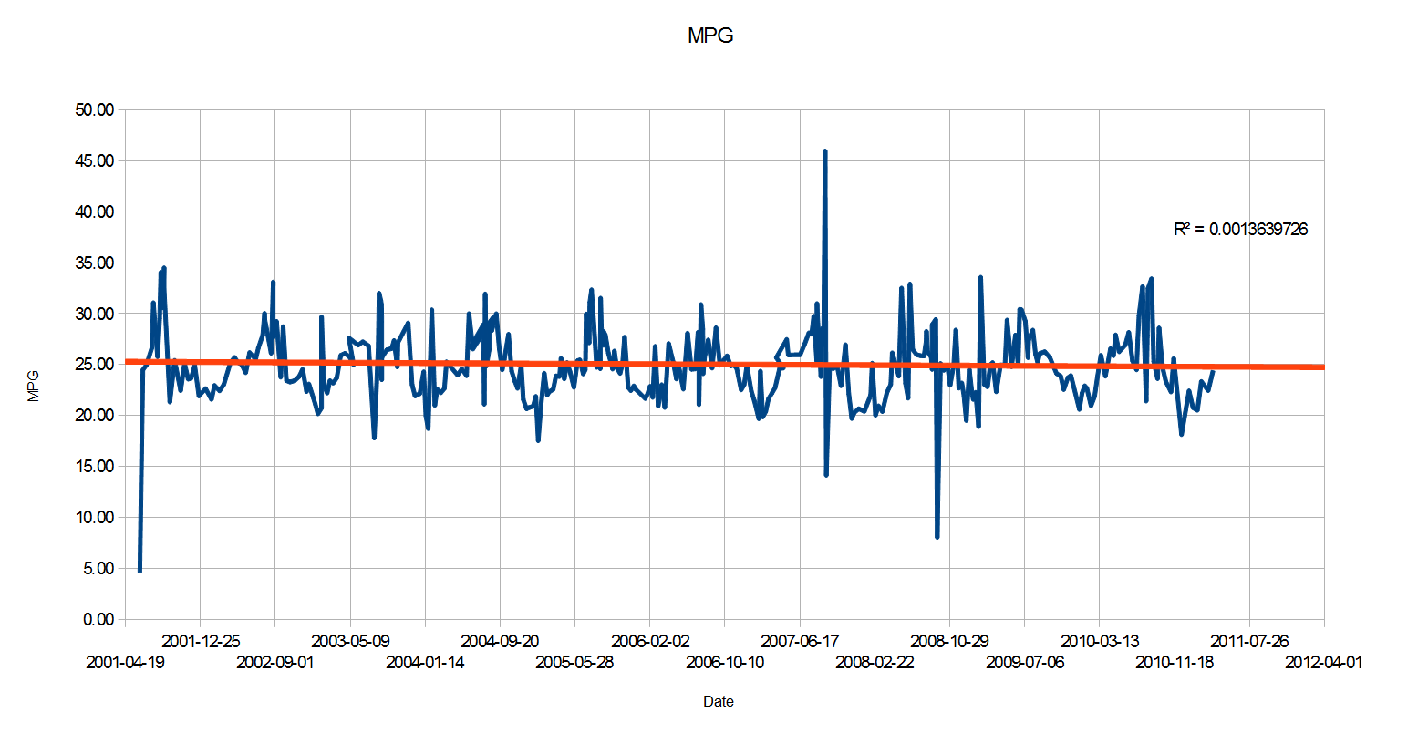
This graph shows the fuel economy of the car over its lifetime in Miles/US Gallon (because who actually like reading things in L/100KM). While there are periods of higher fuel efficiency during our summer holiday trips, and those of lower economy during the winters driving around the city with the heaters on (both shown by the repetitive sin-wave-like motion of the graph), the overall efficiency of the car has actually not degraded over the years. As you can see from the trend line the overall average was 25 MPG, which when compared to the official combined fuel economy rating of 24 MPG, means the car (though possibly spending more of its driving time on highways than the tested average) was well within a reasonable range of what it should have been. This average fuel economy extends the length of the graph and goes to show how the car has lost almost no efficiency over a decade of driving.
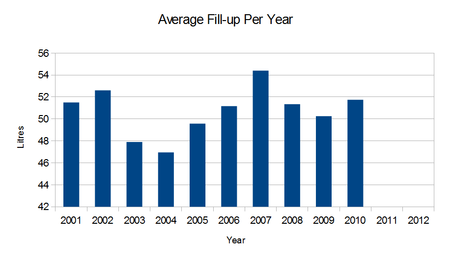
This graph shows the average fill-up in Litres for the car during each year. This information by itself is not necessarily useful, but when paired with other statistics like the average cost of a tank of gas, distance driven per year, or frequency of fill-ups could support some interesting trends.
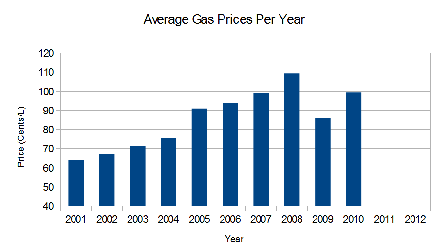
This graph is mostly just a compressed version of the fuel prices graph at the beginning but does show a much cleaner version of the same data. It is interesting to note how smooth and continuous the trend was up till 2008 and how the year average for 2008, while having gas prices peak at over 130 cents/L works out to only 110 cents/L due to the rock bottom prices seen in the second half of the year.
This final graph shows a comparison between the number of fill-ups per year, the distance travelled that year, and the fuel price in that year. This is an interesting graph as it it able to show trends between the use of fuel both in number of fill-up as well as distance while comparing that to the cost of gas at the time. Although it is easy to see what a change in the distance travelled does to the number for fill-ups, it is much harder to see any correlation with the cost of fuel. One could argue that the above average increase in fuel prices starting in the year 2004 contributed to the decline in fuel use but without knowing all the external factors it would be premature to directly connect the two.
The Input and Error
With nearly 12 years worth of hand-written notes to sort through there were plenty of errors in the data that needed to be weeded out before any meaningful results could be found. To accomplish this I created a complex set of equations to check all the raw data against itself in order to make sure there would be no (or as few as possible) incorrect entries or outliers. The following are the checks that I made to ensure the integrity of the data: comparing the trip distance to the recorded odometer reading to make sure that they aligned, if not then the odometer reading would be used. Each of the fill-up price, fill-up litres, and cost/L were checked against each other to make sure that if one was wrong or missing it would take the value that lined up with the two accurate values we did have. This method worked well in all but a few cases were there was either too much missing data to rely on the equations or there were so many things wrong with the data that none of it lined up. In these cases I manually calculated values based on the average for the car in whatever category was missing. With the checks that I did I am certain that with the exception of only a few entries the data is all original and well within what I was expecting.
Conclusion
While the data in this article only covers up till part way through the year 2011 I have plans to finish inputting the second booklet of data which will bring the statistics up to the present day. I will continue to input data into this spreadsheet for as long as this car keeps running in the hopes of knowing more about how cars run throughout their life and when a good time to start looking for a replacement is. As for the findings, so far I am very pleased with the amazing in-sight into the different trends I have found and the consistency with which they have shown through.


